wxmplot Examples
The wxmplot Overview showed a few illustrative examples using wxmplot. Here we show a few more examples. These and more are given in the examples directory in the source distribution kit.
Dynamic examples not shown here
Several examples are not shown here either because they show many plots or are otherwise more complex. They are worth trying out.
demo.py will show several 2D Line plot examples, including a plot which uses a timer to simulate a dynamic plot, updating the plot as fast as it can - typically 10 to 30 times per second, depending on your machine.
stripchart.py also shows a dynamic, time-based plot.
theme_compare.py renders the same plot with a selection of different themes.
image_scroll.py shows an updating set of images on a single display. Perhaps surprisingly, this can be faster than updating the 2D line plots.
Scatterplot Example
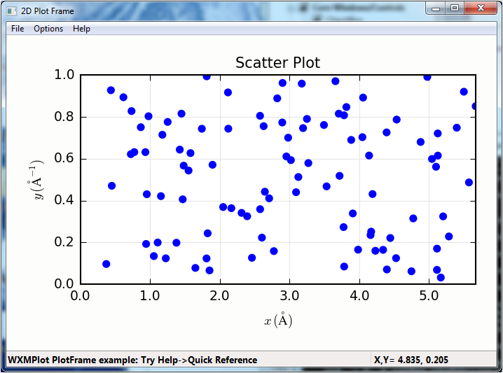
An example scatterplot can be produced with a script like this:
#!/usr/bin/python
#
# scatterplot example, with lassoing and
# a user-level lasso-callback
import sys
import wx
import wxmplot
import numpy

x   = numpy.arange(100)/20.0 + numpy.random.random(size=100)
y   = numpy.random.random(size=len(x))
def onlasso(data=None, selected=None, mask=None):
    print( ':: lasso ', selected)

app = wx.App()

pframe = wxmplot.PlotFrame()
pframe.scatterplot(x, y, title='Scatter Plot', size=15,
                   xlabel='$ x\, \mathrm{(\AA)}$',
                   ylabel='$ y\, \mathrm{(\AA^{-1})}$')
pframe.panel.lasso_callback = onlasso
pframe.write_message('WXMPlot PlotFrame example: Try Help->Quick Reference')
pframe.Show()
#
app.MainLoop()
and gives a plot (after having selected by “lasso”ing) that looks like this:
Plotting with errorbars
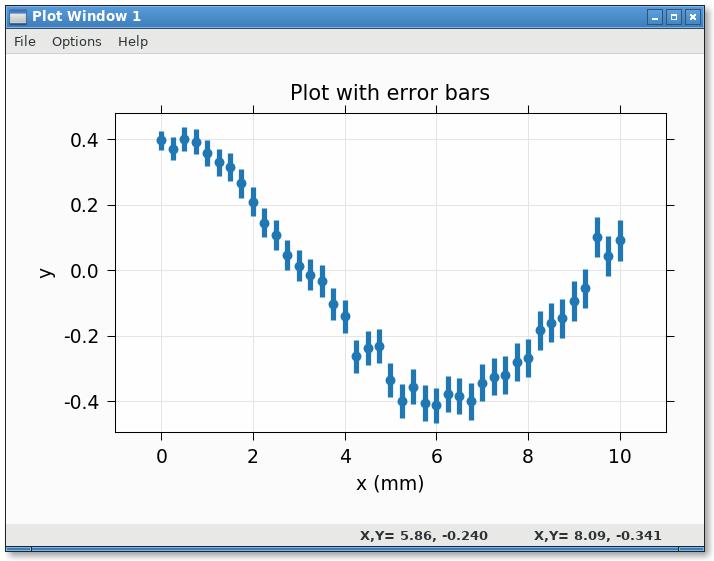
An example plotting with error bars:
#!/usr/bin/python
import numpy as np
import wxmplot.interactive as wi

npts = 41
x  = np.linspace(0, 10.0, npts)
y  = 0.4 * np.cos(x/2.0) + np.random.normal(scale=0.03, size=npts)
dy = 0.03 * np.ones(npts) + 0.01 * np.sqrt(x)

wi.plot(x, y, dy=dy, linewidth=0, marker='o',
        xlabel='x (mm)', ylabel='y', viewpad=10,
        title='Plot with error bars')
gives:
Plotting data from a datafile
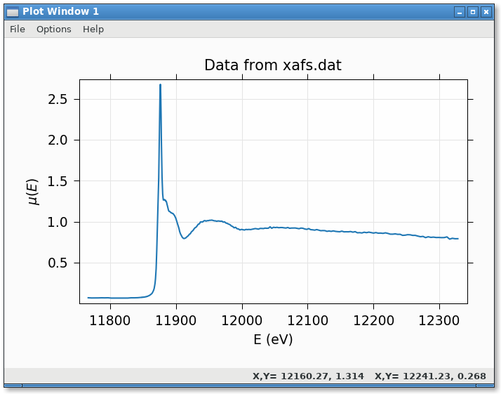
Reading data with numpy.loadtext and plotting:
#!/usr/bin/python
from os import path
import numpy as np
import wxmplot.interactive as wi

fname = 'xafs.dat'
thisdir, _ = path.split(__file__)
dat = np.loadtxt(path.join(thisdir, fname))

x = dat[:, 0]
y = dat[:, 1]

wi.plot(x, y, xlabel='E (eV)', ylabel=r'$\mu(E)$',
        label='As K edge', title='Data from %s' % fname)
gives:
Using Left and Right Axes
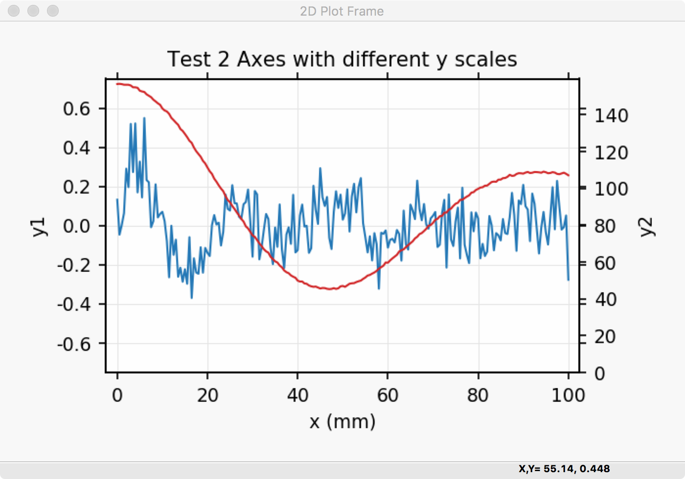
An example using both right and left axes with different scales can be created with:
#!/usr/bin/python
#
#  example plot with left and right axes with different scales
import numpy as np
import wxmplot.interactive as wi

noise = np.random.normal
n = 201
x  = np.linspace(0, 100, n)
y1 = np.sin(x/3.4)/(0.2*x+2) + noise(size=n, scale=0.1)
y2 = 92 + 65*np.cos(x/16.) * np.exp(-x*x/7e3) + noise(size=n, scale=0.3)


wi.plot(x, y1, title='Test 2 Axes with different y scales',
        xlabel='x (mm)', ylabel='y1', ymin=-0.75, ymax=0.75)
wi.plot(x, y2, y2label='y2', side='right', ymin=0)
and gives a plot that looks like this:
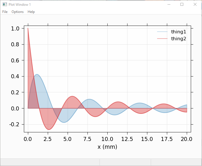
Plotting with alpha-fill to show area under a curve
It is sometimes desirable to fill the area below a curve, typically to 0. Using the alpha value can be especially helpful for this, so that
#!/usr/bin/python
import numpy as np
import wxmplot.interactive as wi

x = np.linspace(0.0, 20.0, 201)
y1 = np.sin(x)/(x+1)
y2 = np.cos(x*1.1)/(x+1)

wi.plot(x, y1, label='thing1', alpha=0.25, fill=True, xlabel='x (mm)')
wi.plot(x, y2, label='thing2', alpha=0.40, fill=True, show_legend=True)
will give:
Plotting with alpha-fill to show uncertainty
Another use of a filled band is to fill between two traces. An important use of this is to show uncertainties in a function, similar to showing errorbars above. If dy and fill=True are both given, then a band between y-dy and y+dy will be filled, as with:
#!/usr/bin/python
import numpy as np
import wxmplot.interactive as wi

x = np.linspace(0.0, 20.0, 201)
y1 = np.sin(x)/(x+1)
dy1 = 0.04 * np.ones(201)

y2 = np.cos(x*1.1)/(x+1)
dy2 = 0.07 * np.ones(201)

wi.plot(x, y1, dy=dy1, label='thing1', alpha=0.25, fill=True, xlabel='x (mm)')
wi.plot(x, y2, dy=dy2, label='thing2', alpha=0.40, fill=True, show_legend=True)
which gives:
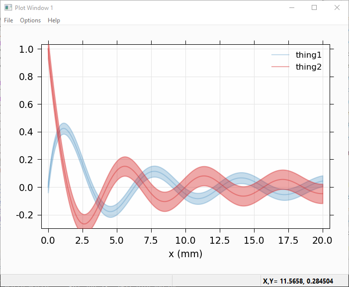
Of course, you can use that to recast showing a band between any two curves by assigning the average of the 2 curves to y and half the difference to dy, and perhaps setting linewidth=0 to suppress showing the mean value.
Displaying and image of a TIFF file
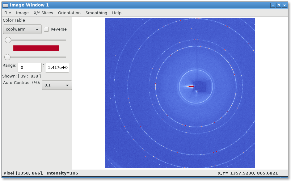
Reading a TIFF file and showing the image:
from os import path
from tifffile import imread

import wxmplot.interactive as wi

thisdir, _ = path.split(__file__)
imgdata =  imread(path.join(thisdir, 'ceo2.tiff'))

wi.imshow(imgdata, contrast_level=0.1, colormap='coolwarm')
gives:
3-Color Image
If the data array has three dimensions, and has a shape of (NY, NX, 3), it is assumed to be a 3 color map, holding Red, Green, and Blue intensities. In this case, the Image Frame will show sliders and min/max controls for each of the three colors.
"""
example showing display of R, G, B maps
"""
import wx
from numpy import exp, random, arange, outer, array
from wxmplot import ImageFrame

def gauss2d(x, y, x0, y0, sx, sy):
    return outer( exp( -(((y-y0)/float(sy))**2)/2),
                  exp( -(((x-x0)/float(sx))**2)/2) )


if __name__ == '__main__':
    app = wx.App()
    frame = ImageFrame(mode='rgb')
    ny, nx = 350, 400
    x = arange(nx)
    y = arange(ny)
    ox =  x / 100.0
    oy = -1 + y / 200.0
    red  = 0.02 * random.random(size=nx*ny).reshape(ny, nx)
    red =  red + (6.0*gauss2d(x, y, 90,   76,  5,  6) +
                  3.0*gauss2d(x, y, 165, 190,  70,  33) +
                  2.0*gauss2d(x, y, 180, 100,  12,  6))
    green  = 0.3 * random.random(size=nx*ny).reshape(ny, nx)
    green = green  + (5.0*gauss2d(x, y, 173,  98,  4,  9) +
                      3.2*gauss2d(x, y, 270, 230, 78, 63))

    blue = 0.1 * random.random(size=nx*ny).reshape(ny, nx)
    blue = blue + (2.9*gauss2d(x, y, 240, 265,  78,  23) +
                   3.5*gauss2d(x, y, 185,  95,  22, 11) +
                   7.0*gauss2d(x, y, 220,  310,  40,  133))

    dat = array([red, green, blue]).swapaxes(2, 0)
    frame.display(dat, x=ox, y=oy,
                  subtitles={'red':'Red Image', 'green': 'Green Blob', 'blue': 'other'})
    frame.Show()
    app.MainLoop()
giving a plot that would look like this:
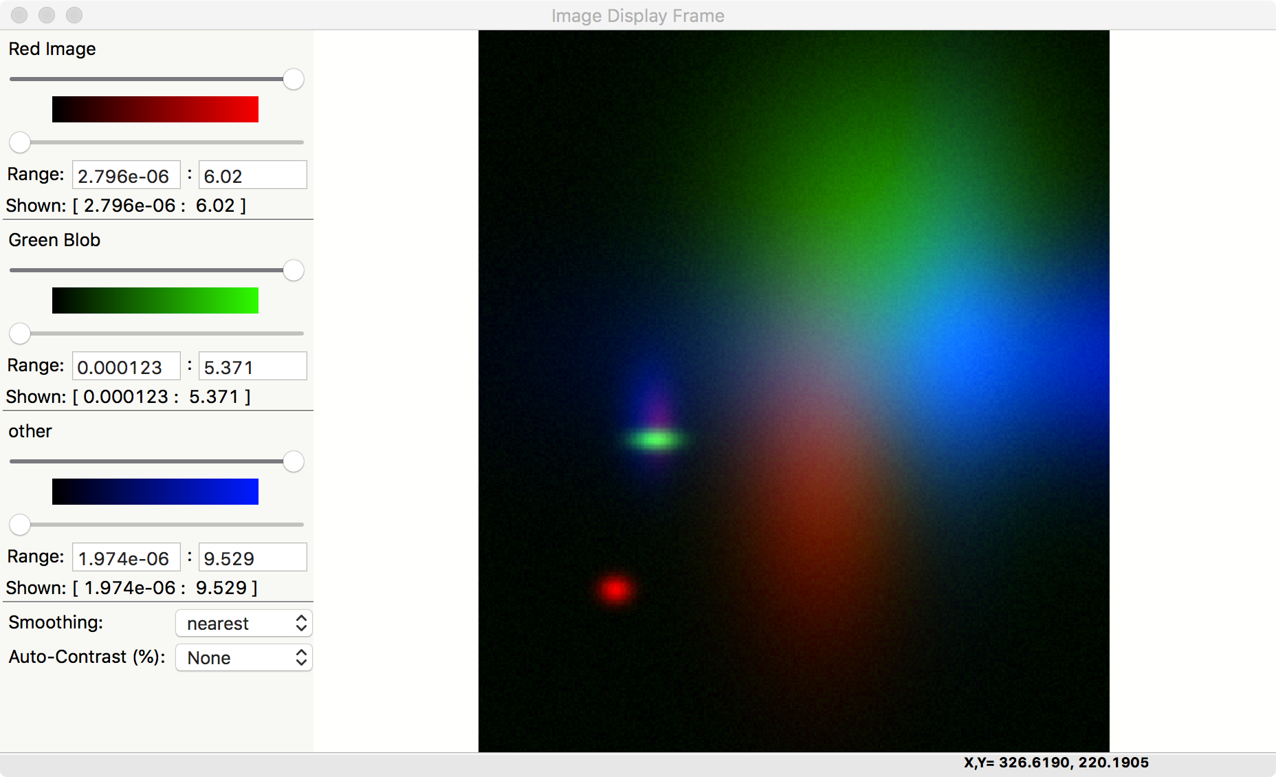
Note that there is also an Image->Toggle Background Color (Black/White) menu selection that can switch the zero intensity color between black and white. The same image with a white background looks like:
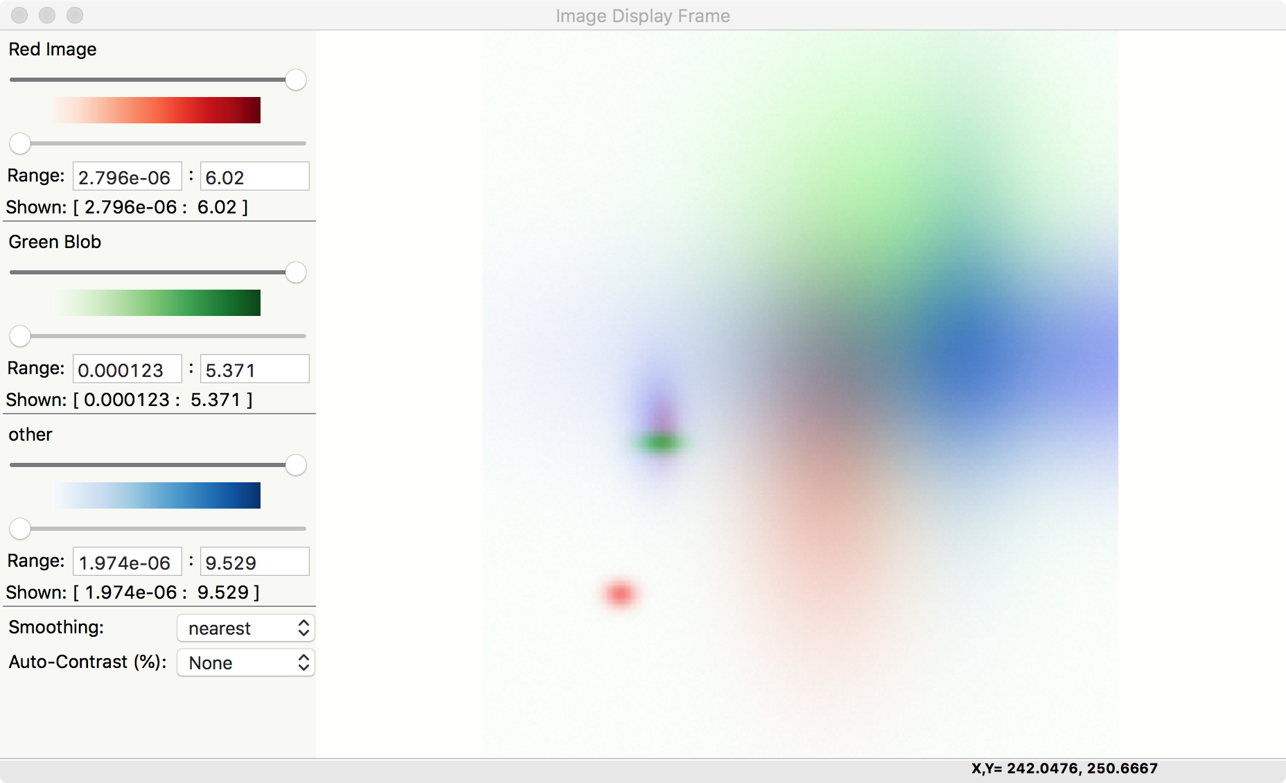
This gives a slightly different view of the same data, with results that may be more suitable for printed documents and presentations.